Fix Your PPC Landing Page Headline in 48 Hours for Paid Campaigns

A PPC landing page is a dedicated, post-click destination built around one conversion goal, and the single fastest lever for improving one is message match: making the page headline echo the ad headline and CTA that got the click. Get that right, along with a single call to action, and you’ll see it show up in both your Quality Score and your cost per click. Everything else on this page supports that one decision.
TL;DR:
- Prioritize message match by ensuring headlines exactly reflect ad promises and eliminate navigation menus to reduce exit points, boosting conversions.
- Focus on creating a single, clear offer with a concise form under four fields and position trust signals above the fold to increase visitor reassurance.
- Optimize for speed with compressed images, fewer third-party scripts, and CDN use to improve load times and Quality Score, lowering ad costs.
- Test one variable at a time and track conversion rate, CPA, and ROAS to identify effective changes, pausing or rebuilding when basic fixes fail.
- Use AI-powered audits to automatically detect message mismatches, slow-loading scripts, and other issues in priority order, saving time and maximizing campaign impact.
Table of Contents
- What Makes PPC Landing Pages Different From Regular Web Pages
- The Non-Negotiables: Message Match, One Goal, Zero Friction
- Copy, Layout, and Social Proof That Actually Convert
- Speed, Mobile, and the Technical Checklist Most Teams Skip
- Testing and Measurement: Proving the Page Actually Works
- Templates, Builders, and a Pre-Launch Checklist
- What AI-Assisted Audits Catch That Manual Reviews Miss
- Fast Fixes First, Then Fix Your Habits
- Where to Verify These Practices Yourself
- Sources
What Makes PPC Landing Pages Different From Regular Web Pages
A PPC landing page isn’t a homepage wearing a different headline. It’s a purpose-built page stripped of everything that doesn’t serve the one action you want a visitor to take after clicking a paid ad. Send that same traffic to your homepage instead, and you lose the message match that got the click in the first place, along with the clean data you need to know what’s actually working.
Google’s own guidance on landing page experience rates pages on three things: how well they match the ad and keyword, how mobile-friendly they are, and how easy they are to navigate. That score feeds directly into Quality Score, and Quality Score sets your cost per click. A page that scores “below average” on landing page experience can cost you noticeably more per click than a competitor bidding on the same keyword with a tighter page.
Here’s what actually makes up that experience rating:
- Relevance: does the page content match what the ad and keyword promised?
- Transparency: is it obvious what you’re offering and what happens next?
- Navigability: can a visitor complete the intended action without hunting for it?
- Speed: does the page load fast enough that impatient mobile users don’t bounce?
Dedicated pages also produce cleaner reporting. When every campaign, ad group, or even individual ad points to its own landing page, you can attribute conversions precisely instead of guessing which of five traffic sources actually drove a form fill. Unbounce’s breakdown of PPC landing pages makes the same point: dedicated pages beat generic ones because they isolate intent and let you optimize one variable at a time.
The Non-Negotiables: Message Match, One Goal, Zero Friction
Before you touch fonts or hero images, fix these three things. They’re the highest-leverage changes you can make, and most underperforming pages get at least one of them wrong.
- Match your headline to the ad, word for word where possible. If the ad promises “Free 15-Minute SEO Audit,” the landing page headline should say exactly that, not a rebranded version like “Grow Your Online Presence Today.” Visitors decide in seconds whether they landed in the right place.
- Kill the navigation menu. Every link that isn’t the CTA is an exit ramp. Remove the header nav, footer links, and any “back to homepage” option. You paid for this click; don’t hand it back for free.
- Give the page one job. One offer, one CTA, repeated as needed but never competing with a second offer. A page asking visitors to “Download the Guide” or “Book a Demo” splits attention and tanks both conversion rates.
- Cut your form down to four fields or fewer. Name, email, phone, and maybe company. Every additional field is a reason to abandon, especially on mobile.
- Put a trust signal above the fold. A review count, a client logo strip, or a star rating near the CTA reassures a skeptical visitor before they scroll.
Shopify’s guide to PPC landing page design backs this up with the same core list: match the ad, strip the navigation, sharpen the CTA, and test relentlessly.
Pro Tip: Write your CTA button copy as a completed sentence starter: “Yes, send my audit” or “Start my free trial” beats generic “Submit” or “Learn More” almost every time, because it restates the benefit at the exact moment of decision.
Copy, Layout, and Social Proof That Actually Convert
Once the non-negotiables are locked in, the next round of gains comes from how you write and arrange the page. This is where most teams either overthink the design or underthink the copy, and both mistakes cost conversions.
Headlines and subheadlines
Your headline states the benefit in one line. Your subheadline backs it up with a specific mechanism or proof point. “Cut your ad spend waste by fixing your landing page” is a headline; “See exactly where your Quality Score is losing you money in under 10 minutes” is the subheadline that makes the promise concrete. HubSpot’s guide to high-converting PPC landing pages treats this headline-plus-support pairing as foundational, and for good reason: a visitor who doesn’t understand the offer in five seconds won’t stick around to figure it out.
Hero imagery and visual hierarchy
Show the outcome, not the process. A software page should show the dashboard the customer will actually use, not a stock photo of people pointing at a laptop. A service page should show the result (a cleaner inbox, a fuller calendar, a five-star review widget) rather than generic “professional team” imagery that says nothing about the offer. Visual hierarchy matters just as much as the image itself: the CTA button should be the most visually dominant element on the page after the headline, using color contrast rather than size alone to stand out.

Social proof that actually moves people
Not all social proof carries equal weight. In order of persuasive strength for cold paid traffic:
- Specific customer results (“Increased qualified leads by 40% in 60 days”) outperform vague testimonials.
- Recognizable client logos work well for B2B offers where credibility by association matters.
- Star ratings and review counts work well for local and consumer services, especially when tied to a platform visitors already trust.
- Generic praise quotes (“Great service!”) do the least work and are often skipped entirely by scanning visitors.
Place your strongest proof point directly beneath the hero section, before you ask for any information. A second, more detailed proof section (a short case study or a cluster of specific results) works well just above the final CTA, where a visitor who’s still on the fence needs one more reason to convert.
CTA placement and repetition
Repeat your CTA at least twice on any page longer than one scroll: once above the fold, once at the natural end of the content. For longer pages, a third CTA embedded contextually after a strong proof point captures visitors who convert on emotion rather than logic. What you should never do is introduce a second, different CTA. Repetition of the same action reinforces it; a competing action splits it.
Pro Tip: If you’re running the same offer across multiple ad groups with different keywords, build one landing page per intent cluster rather than one page for everything. A visitor searching “emergency plumber” and one searching “plumbing maintenance plans” need different headlines even if they end up booking the same service.
Good ad-to-page copy consistency doesn’t happen by accident. If your team is still writing ad copy and landing page copy in separate documents, that’s usually where message match breaks down first. Reviewing your approach to persuasive ad copy alongside your landing page draft, side by side, catches mismatches before they cost you clicks.
Speed, Mobile, and the Technical Checklist Most Teams Skip
Message match gets a visitor to nod. Speed determines whether they stick around long enough to act on that nod. Most paid traffic now arrives on mobile, and mobile users abandon slow pages fast.
Google’s Core Web Vitals give you three specific things to optimize, in priority order for landing pages:
- Largest Contentful Paint (LCP): how fast your main content (usually the hero section) becomes visible. Aim for under 2.5 seconds.
- Interaction to Next Paint (INP): how responsive the page feels when someone taps a button or field. Sluggish forms kill conversions here.
- Cumulative Layout Shift (CLS): whether elements jump around as the page loads, which frustrates users and can cause misclicks on the wrong button.
Image weight is usually the biggest single offender on LCP. Convert hero images to WebP format, compress aggressively, and lazy-load anything below the fold so it doesn’t compete with your hero image for bandwidth on page load.
Third-party scripts are the second biggest offender, and the one teams overlook most. Chat widgets, heat-mapping tools, retargeting pixels stacked three deep, and old A/B testing snippets you forgot to remove all add render-blocking weight. Research on third-party script impact recommends auditing every tag on the page, mapping which ones actually support the paid funnel, and removing or deferring the rest. Most landing pages carry at least one script nobody remembers adding.
Round out the technical pass with a CDN and proper caching so returning visitors and geographically distant users don’t wait on a cold server response.
Statistic Callout: Landing page experience feeds directly into Quality Score, and Quality Score is one of the biggest levers you have on cost per click. A slow, script-heavy page doesn’t just lose visitors. It makes every future click on that ad more expensive.
Testing and Measurement: Proving the Page Actually Works
A landing page you never test is a guess wearing a URL. Testing turns opinion into evidence, but only if you run the test correctly.
- Change one variable at a time. Testing a new headline and a new hero image simultaneously tells you nothing about which one moved the needle.
- Let the test run to a valid sample size. Ending a test after 40 conversions because one variant is “winning” is how teams talk themselves into changes that don’t actually hold up.
- Track the right primary KPIs. Conversion rate matters, but cost per acquisition (CPA) and return on ad spend (ROAS) tell you whether those conversions are actually profitable. Landing page experience score in Google Ads is your early warning signal before CPA creeps up.
- Watch secondary signals. Bounce rate, time on page, and scroll depth won’t tell you why a page fails, but they tell you where to look first.
- Set up UTMs and pixels before you launch, not after. Every ad variation should carry its own UTM parameters, and enhanced conversions should be configured so your conversion data stays accurate even as browser tracking restrictions tighten.
- Know when to pause versus rebuild. If a page underperforms but the fundamentals (message match, load speed, single CTA) are solid, iterate on copy and layout. If it’s failing across the board, a rebuild is faster than a dozen small tweaks that never add up.
LanderLab’s diagnostic framework for Google Ads landing pages is a useful reference point here, offering benchmark ranges by vertical so you’re not judging your conversion rate against an arbitrary industry-wide average that doesn’t reflect your niche.
Templates, Builders, and a Pre-Launch Checklist
Speed to launch matters in paid campaigns, and the right starting template shortens the path from ad approval to live page. Four template categories cover most PPC use cases:
- Lead-gen pages: short form, single offer, built for B2B services or consultations.
- Product pages: e-commerce focused, built around one SKU or bundle rather than a full catalog.
- Webinar and event pages: date-driven urgency, registration form, often paired with countdown elements.
- App-install pages: mobile-first layout with store badges above the fold and minimal scrolling required.
Choosing between a hosted landing page builder, an in-site template, and a fully custom build comes down to speed versus control. A hosted builder gets you live in hours and usually includes built-in speed optimization, which makes it a strong fit for a fast-moving test. An in-site template on your existing CMS keeps branding and analytics unified but requires more setup discipline to avoid dragging in your site’s full navigation and script stack. A custom build gives you full control over speed and design but takes the longest, so it’s usually reserved for high-volume, always-on campaigns rather than a two-week seasonal push. ForgeWeb Studio’s collection of high-converting landing page templates is a solid reference point for seeing these template categories in practice.
Before any template goes live, run it through this checklist:
- Does the headline match the ad that will drive traffic to it?
- Does it load in under three seconds on a mid-range mobile connection?
- Is there exactly one CTA and zero navigation links?
- Are UTM parameters and conversion pixels installed and firing correctly?
- Is the form under four fields, and is a trust signal visible without scrolling?
What AI-Assisted Audits Catch That Manual Reviews Miss
Most landing page problems aren’t mysterious once you know where to look, but finding them manually across dozens of campaigns is slow. AI-assisted audits earn their keep by scanning every active page against the same checklist simultaneously: message match scoring against live ad copy, image weight flags, third-party script inventories, and mobile load time, all ranked by likely impact on Quality Score rather than by what looks broken to the eye.
That ranking matters more than the audit itself. A page with a slow-loading testimonial carousel and a mismatched headline needs the headline fixed first, because message match moves Quality Score faster than shaving 400 milliseconds off load time. An automated pass that surfaces issues in priority order saves a marketing team from spending a week on cosmetic fixes while the real leak, a headline that doesn’t match the ad, keeps draining budget.
A few things worth noting for teams evaluating this approach:
- Prioritized fixes beat exhaustive audits when campaign budgets are live and every day of mismatch costs money.
- Script audits catch tags added months ago for a campaign that’s long since ended but never removed.
- Cross-campaign pattern detection (the same mistake repeated across a dozen ad groups) is where automated review outpaces a manual spot check.
(Client case data and specific before-and-after audit results, including named client outcomes and program specifics, are being compiled for a future update to this section.)
Fast Fixes First, Then Fix Your Habits
If you inherited a paid campaign with an underperforming landing page, spend your first 48 hours on three things: fix the headline so it mirrors the ad, delete the navigation menu entirely, and compress the hero image. Those three changes alone often move conversion rate more than a full redesign, because they address the mismatch and friction that actually stop visitors from acting.
The mistakes I see repeated across accounts aren’t exotic. Teams send paid traffic to the homepage because “it’s already built.” Teams run five offers on one page because removing options feels like leaving money on the table, when in practice it just confuses the visitor into leaving with nothing. And teams skip testing entirely, changing the whole page at once and calling the result a “redesign” instead of a controlled experiment they can actually learn from.
Handle it yourself when the fixes are structural and clear: headline, navigation, form length, image compression. Bring in outside help when you’re staring at a Quality Score that won’t budge despite fixing the obvious problems, or when script bloat and tracking issues have compounded across dozens of pages faster than one person can reasonably untangle.
— Prasad
Where to Verify These Practices Yourself
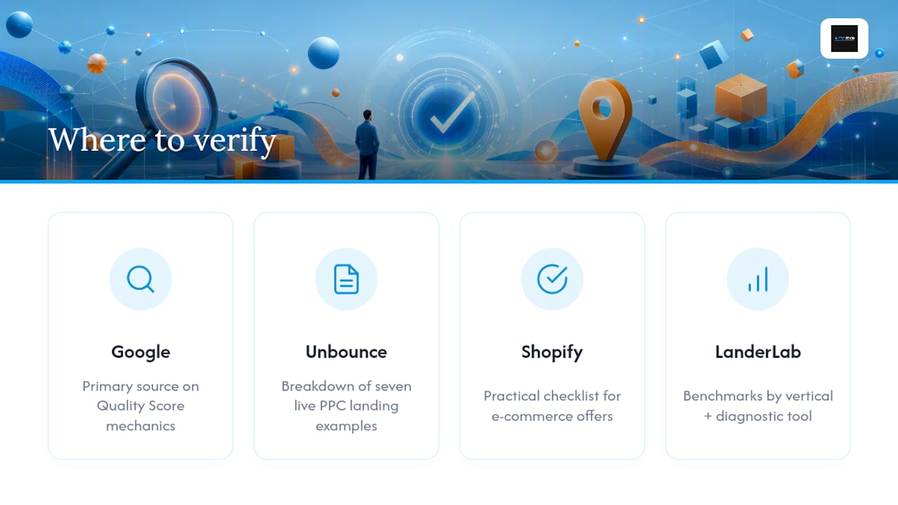
Start with Google’s own landing page experience guidance if you want the primary source behind Quality Score mechanics. It’s the closest thing to ground truth for how Google actually evaluates your page.
For message-match audits and real examples of dedicated PPC pages done well, Unbounce’s landing page breakdown walks through seven live examples worth studying. Shopify’s practical checklist covers the same fundamentals from an e-commerce angle, useful if your offer is product-based rather than lead-gen. And for benchmark ranges by vertical alongside a diagnostic tool you can run against your own page, LanderLab’s Google Ads landing page guide is worth bookmarking.
If your ad copy needs the same scrutiny as your landing pages, Aiseo’s search engine marketing resources cover the alignment work that keeps both sides of the click consistent.
Fixing your landing pages is only half the equation. If the traffic itself isn’t converting because of a reputation gap, prospects who click your ad and then check your reviews before filling out a form will bounce regardless of how fast your page loads. Aiseo built ReviewSync to close that gap: multi-platform review management, sentiment tracking, and automated responses that turn your review presence into another trust signal working in your favor at the exact moment a paid visitor is deciding whether to convert. Pair a tightened landing page with a managed reputation strategy, and you’re addressing both sides of the conversion decision instead of just one. Explore what Aiseo’s full marketing services can do for your paid campaigns before your next budget cycle starts.
Sources
- Optimize your ads and landing pages – Google Ads Help
- What is a PPC landing page? (With 7 real examples for Google Ads) – Unbounce
- PPC landing page design: Tips and best practices – Shopify